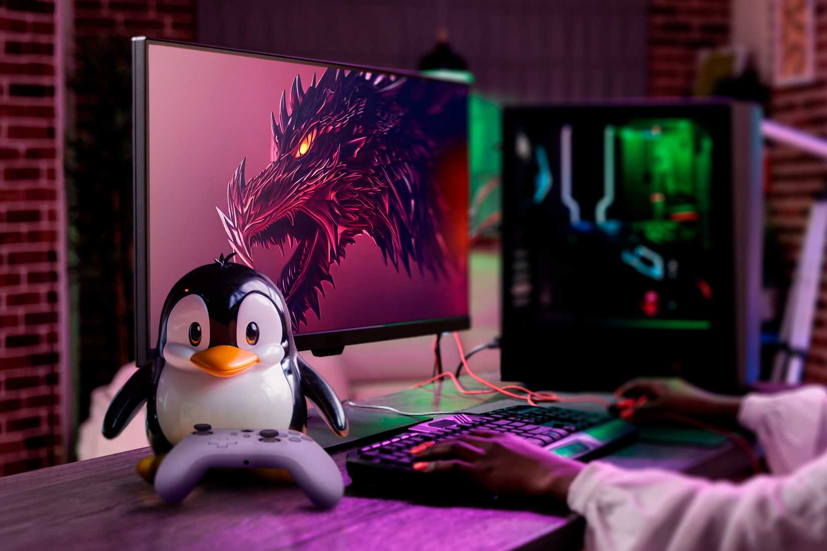
Imagine a world where the face of your operating system wasn’t a cold, glowing window or a fruit with a bite taken out of it, but a flightless bird that looks like it just finished a massive meal. For decades, the Linux mascot has been the unofficial face of open-source gaming and development, standing in stark contrast to the sterile, minimalist designs of the modern era. While other tech giants are stripping away personality in favor of flat geometry, the story of Tux the penguin reminds us that software used to have a sense of humor.
Why this matters: As we approach a major era of visual redesigns across the web, the persistence of a "contented cute" mascot like Tux highlights a growing divide between community-driven identity and corporate branding. What started as a simple suggestion on a mailing list 30 years ago has become a symbol of resilience in an industry that is currently obsessed with "modern tech changes" that often feel soulless.
Linus Torvalds and the Penguin Origins

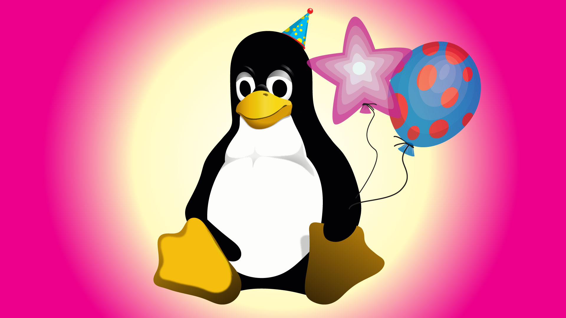
The history of the world’s most famous penguin doesn't begin in a high-end marketing firm. Instead, it started in 1996 when Linus Torvalds, the creator of the Linux kernel, proposed the idea of a mascot via a mailing list email. Torvalds didn't want a fierce predator or a sleek corporate logo; he envisioned something approachable and perhaps a little bit lazy. He initially suggested a design that was "just a black brush-type outline," but the personality of the character was clear from the start. He wanted a penguin that looked like it was "sitting down after having gorged itself, and having just burped."
This specific direction led to the creation of Tux, a character that many describe as slightly overweight and undeniably happy. Unlike the aggressive branding seen in the console wars of the 90s—think Sonic the Hedgehog’s "attitude"—the Linux mascot was designed to be cute and cuddly. It was a radical departure for a piece of software that was, at the time, considered highly technical and difficult to use. By choosing a penguin that looked satisfied with its life, Torvalds gave the open-source movement a friendly face that suggested stability and ease, even if the command line said otherwise.
The Penguin s Deep History is rooted in this 1996 conceptualization, proving that a mascot doesn't need to be "cool" to be iconic. Tux has appeared in countless games, from SuperTuxKart to various cameos in indie titles, cementing his place in gaming culture. He represents a time when tech was about exploration and fun, rather than just engagement metrics and ecosystem lock-in. Even as Linux moves into the mainstream via devices like the Steam Deck, that contented cute bird remains the heart of the platform.
Firefox Icon Shift Slated for 2026

While the Linux mascot remains largely unchanged, other pillars of the open-source world are heading in a different direction. Official teaser videos have revealed that the Firefox icon is slated for a significant reduction in 2026. This move follows a long-standing trend in the tech industry where complex, illustrative logos are simplified into abstract shapes. For many users, this change marks a notable shift in the visual identity of a major web browser that once prided itself on its detailed, fiery fox wrapping around a globe.
The 2026 redesign is part of a broader wave of modern tech changes that prioritize scalability across different screen sizes and resolutions. A detailed illustration might look great on a 4K monitor, but it can become a blurry mess on a tiny smartphone notification bar. By reducing the fox icon, Mozilla is following the playbook of companies like Google and Microsoft, who have moved toward "flat" design. However, this often comes at the cost of the character and charm that originally drew users to the brand.
When you compare the upcoming Firefox shift to the static nature of Tux, you see two different philosophies. One is driven by the need to stay "current" and "professional" in a competitive market, while the other is anchored by a community that values its history. Tux doesn't need to be updated for 2026 because he isn't trying to sell you a subscription or a cloud service; he’s just a penguin who had a very good lunch. This reliability is exactly why the Linux mascot has outlasted so many other tech icons from the 90s.
Modern Tech Changes Impact Digital Identity
The evolution of mascots reflects how our relationship with technology has changed. In the mid-90s, software felt like a hobbyist's playground, and icons like the slightly overweight Tux reflected that experimental spirit. Today, software is a utility, and utilities are expected to look clean, efficient, and unobtrusive. These modern tech changes are often technically superior, but they lack the emotional hook of a character that feels like it has a story. When a logo becomes a set of geometric curves, it loses the ability to "burp" or look "contented."
The Penguin s Deep History shows that a cute and cuddly image can actually be a powerful tool for adoption. In the gaming world, where Linux is seeing a massive surge in popularity thanks to Proton and Valve's hardware, Tux serves as a welcoming ambassador. He tells the player that this isn't just a corporate OS—it's a community project. As we look toward the Firefox changes in 2026, there is a sense of nostalgia for icons that weren't afraid to be a little bit "unpolished" or highly stylized.
Ultimately, the choice between a contented cute mascot and a minimalist glyph is a choice between personality and professionalism. While the 2026 Firefox update will likely be sleek and efficient, it will move the browser one step further away from the era of the "web-fox" that felt like a companion. Meanwhile, Tux will likely remain exactly as he is: sitting down, satisfied, and representing a 30-year-old email from a developer who just wanted a penguin that looked like it had a good time. That kind of branding is rare, and it’s why the Linux mascot continues to matter in a rapidly changing digital landscape.
Future operating systems will likely lean harder into AI-driven interfaces that minimize icons entirely, making the role of a physical mascot feel like a relic of the past. We should expect more brands to follow the Firefox lead by 2026, stripping away illustrative elements to fit into a standardized "glass and blur" aesthetic. However, the Linux mascot will likely survive as a defiant symbol of the old web, maintaining its "slightly overweight" charm for another thirty years.
Frequently Asked Questions
Who created the Linux mascot and when?
The Linux mascot, Tux, was conceptualized in 1996 after Linus Torvalds proposed the idea of a penguin to the Linux mailing list. The final design was created by Larry Ewing using GIMP, following Torvalds' vision of a satisfied, sitting penguin.
What are the upcoming changes to the Firefox icon?
According to official teaser videos, the Firefox fox icon is slated for a significant visual reduction in 2026. This shift is part of a broader trend toward minimalist branding and modern tech changes in the browser industry.
Why is the Linux mascot a penguin?
Linus Torvalds chose a penguin because he found them unique and interesting, specifically requesting a design that looked like it had just "gorged itself." He wanted a mascot that was "cute and cuddly" rather than a standard, aggressive corporate logo.
Confirmed details first, useful context second. This is the quickest path to the source trail and the next pages worth opening.
Source date: May 9, 2026